Market Context (Seller's Climate)
The Seller’s Climate page gives you a macro snapshot of current market conditions from the perspective of an option seller. You find it at /market, or by clicking the link from your dashboard.
Option premiums move with volatility. When the VIX is elevated, premiums are rich and selling is more rewarding — but risk is higher. When volatility is low, premiums shrink and you may want to wait. This page puts the key numbers in one place so you can make that call quickly.
Overview
Section titled “Overview”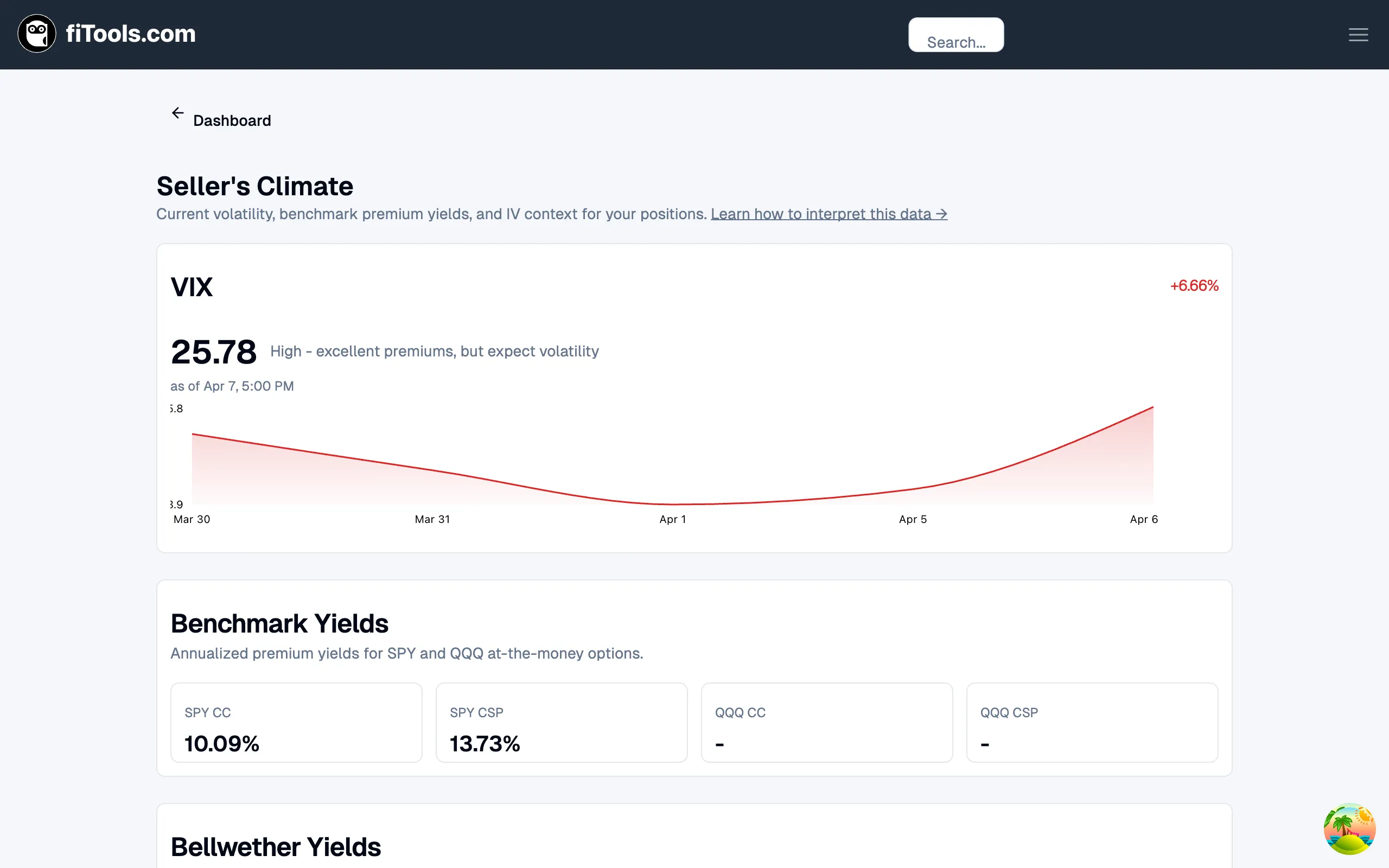
The page is divided into four cards, stacked vertically:
- VIX — current level, daily change, interpretation, and a 5-day sparkline
- Benchmark Yields — annualized premium yields for SPY and QQQ covered calls (CC) and cash-secured puts (CSP)
- Bellwether Yields — premium yields for sector-representative stocks (AAPL, JPM, CAT, JNJ, XOM)
- IV Rank — implied volatility rank for every ticker you currently hold
All data refreshes automatically with a five-minute stale window, so you see near-real-time figures without excessive API calls.
VIX and Volatility Context
Section titled “VIX and Volatility Context”
The VIX card is the first thing you see. It shows:
- Current level — the last VIX reading, displayed in large type.
- Daily change — a signed percentage in the top-right corner. Green means volatility dropped (generally favorable for existing short premium positions); red means it rose.
- Interpretation — a plain-English label such as “High - excellent premiums, but expect volatility” that tells you what the current level means for selling.
- 5-day sparkline — a line chart showing the VIX trend over the past five trading days, so you can see whether volatility is climbing, falling, or range-bound.
How to read the VIX card
Section titled “How to read the VIX card”- Below 15: Premiums are thin. Consider waiting for a better entry, or use longer expirations to collect meaningful premium.
- 15 to 20: Normal range. Standard covered-call and CSP strategies work well here.
- Above 20: Rich premiums. Good selling environment, but keep position sizes conservative because large moves are more likely.
- Above 30: Crisis-level volatility. Premiums are very high, but assignment risk and gap risk are significant. Only sell if you are comfortable owning the underlying at the strike price.
Benchmark Yields
Section titled “Benchmark Yields”
The Benchmark Yields card displays annualized premium yields for the two most widely traded index ETFs:
| Metric | What it tells you |
|---|---|
| SPY CC | Annualized yield from selling an at-the-money covered call on SPY |
| SPY CSP | Annualized yield from selling an at-the-money cash-secured put on SPY |
| QQQ CC | Same for QQQ (tech-heavy Nasdaq 100) |
| QQQ CSP | Same for QQQ |
These numbers act as a “risk-free rate” benchmark for option sellers. If a single-stock covered call yields less than SPY CC, you are taking on company-specific risk for no extra compensation. Each yield cell is clickable and links to the full ticker page for that ETF.
Bellwether Yields
Section titled “Bellwether Yields”
The Bellwether Yields card shows premium yields for five sector-representative stocks:
| Ticker | Sector |
|---|---|
| AAPL | Technology |
| JPM | Financials |
| CAT | Industrials |
| JNJ | Healthcare |
| XOM | Energy |
Each stock displays both a CC (covered call) and CSP (cash-secured put) annualized yield. Together, these five names give you a cross-sector view of where premium is concentrated.
What to look for
Section titled “What to look for”- Sector divergence — if XOM yields are unusually high while AAPL yields are flat, the energy sector is pricing in more uncertainty than tech. That is useful context before you sell premium on an energy stock.
- Absolute levels — compare each bellwether to the SPY/QQQ benchmarks above. A bellwether yielding significantly more than SPY compensates you for the extra single-stock risk.
- Clickable cells — each ticker links to its full detail page where you can explore specific strikes and expirations.
IV Rank for Your Positions
Section titled “IV Rank for Your Positions”
The IV Rank card at the bottom of the page is personalized to your portfolio. It shows the implied volatility rank for every ticker you currently hold an active position in.
Reading the table
Section titled “Reading the table”Each row displays:
- Ticker — the stock symbol.
- IV Rank — a number from 0 to 100 indicating where current implied volatility sits relative to its range over the past year. A rank of 80 means current IV is in the top 20% of its one-year range.
- IV Percentile — shown next to the rank when available, giving you a second measure of how current IV compares to history.
- Progress bar — a visual indicator that fills from left to right as IV rank increases.
- Interpretation — “High vs 1y history” (rank above 67), “Middle range” (34-66), or “Low vs 1y history” (rank 33 or below).
Why IV rank matters for sellers
Section titled “Why IV rank matters for sellers”Option sellers want to sell when implied volatility is high relative to its own history. That is when premiums are richest and most likely to contract (mean-revert), which benefits short premium positions.
- IV Rank above 67: Favorable for selling. Premiums are elevated relative to the past year.
- IV Rank 34-66: Neutral. Premiums are at normal levels.
- IV Rank below 33: Premiums are cheap. Consider waiting for a better entry, or shift to strategies that benefit from rising volatility.
Next Steps
Section titled “Next Steps”- Visit the Options Screener to act on what you see in the Seller’s Climate data.
- Learn more about implied volatility in the Options section of the handbook.
- Return to the Dashboard to see how Market Context fits into your daily workflow.