Seller's Climate
The Seller’s Climate page gives you a macro snapshot of the options market in one glance. It answers a single question every premium seller asks before opening a new position: is now a good time to sell?
You can reach it from the dashboard by clicking the arrow on the Market Strip, or directly at /market.
Reading the VIX card
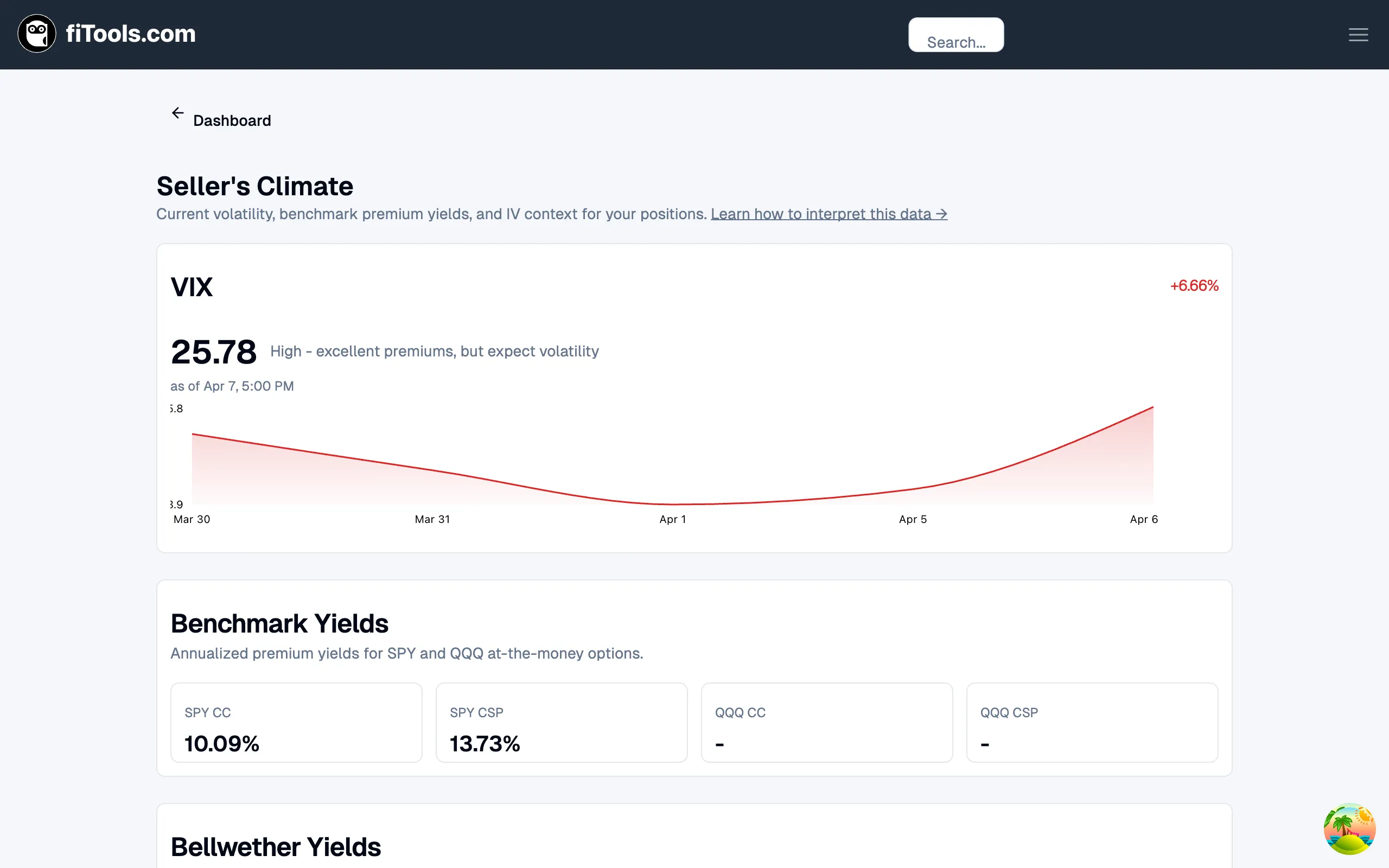
Section titled “Reading the VIX card”The VIX card sits at the top of the page and is the first thing you should check. It shows:
- Current level — the VIX closing value as a large number.
- Daily change — the percentage move since the prior close, colored red when volatility is rising and green when it is falling.
- Interpretation — a plain-English label that categorizes the current level (for example, “High — excellent premiums, but expect volatility”).
- Sparkline — a five-day chart so you can see the recent trend at a glance.
What the VIX levels mean
Section titled “What the VIX levels mean”| VIX Range | Label | What it means for sellers |
|---|---|---|
| Below 15 | Low | Premiums are thin. You may need to go closer to the money or further out in time to collect meaningful income. |
| 15 — 20 | Normal | The sweet spot for most sellers. Premiums are fair and price moves are manageable. |
| 20 — 30 | High | Rich premiums, but expect larger daily swings. Widen your strikes or reduce position size. |
| Above 30 | Very high | Crisis-level volatility. Premiums are excellent if you have conviction, but assignment risk is elevated. |
Benchmark yields
Section titled “Benchmark yields”Below the VIX card, four tiles show the annualized premium yields for at-the-money SPY and QQQ options:
- SPY CC — covered call yield on SPY
- SPY CSP — cash-secured put yield on SPY
- QQQ CC — covered call yield on QQQ
- QQQ CSP — cash-secured put yield on QQQ
These benchmarks answer the question “what return would I get for selling the most vanilla trade on the broadest index?” Use them as a baseline: if a specific stock’s yield is significantly higher than SPY’s, the market is pricing in more risk for that name.
Bellwether yields
Section titled “Bellwether yields”The next section shows premium yields for five sector-representative stocks:
| Ticker | Sector |
|---|---|
| AAPL | Technology |
| JPM | Financial Services |
| CAT | Industrials |
| JNJ | Healthcare |
| XOM | Energy |
Each card displays both the covered call (CC) and cash-secured put (CSP) annualized yields. Together, these five names give you a cross-sector read on where premium is richest.
When one sector’s bellwether shows a yield well above the others, it usually means the market expects more movement in that sector — earnings season, regulatory news, or macro shifts. That can be an opportunity or a warning depending on your risk tolerance.
Like the benchmark tiles, each bellwether card links to the ticker’s detail page.
IV Rank for your positions
Section titled “IV Rank for your positions”The final section appears only when you have open positions. It shows the implied volatility rank for each ticker you currently hold, measured against the past year of IV data.
For each ticker you see:
- IV Rank — where current implied volatility sits relative to its 52-week range (0 = lowest, 100 = highest).
- IV Percentile — what percentage of days over the past year had lower IV than today.
- Bar gauge — a visual indicator of the rank.
- Interpretation — “High vs 1y history”, “Low vs 1y history”, or “Middle range”.
Putting it all together
Section titled “Putting it all together”A quick mental checklist when you visit this page:
- Check the VIX. If it is in the normal-to-high range, conditions favor sellers. If it is very low, set realistic yield expectations.
- Compare benchmarks. SPY yields set your floor. Any individual stock should beat these to justify the extra concentration risk.
- Scan bellwethers. Look for sectors with outsized yields — that is where opportunity (and risk) is concentrated today.
- Review your IV ranks. High IV rank on your existing positions means time is working for you. Low IV rank might mean it is time to roll or close.
Related pages
Section titled “Related pages”- Platform Tour — overview of the full app including the Market Strip on the dashboard
- Options Screener — find specific trades once you have confirmed the market environment
- How Covered Calls Work — background on the CC strategy referenced in the yield cards
- How CSPs Work — background on the CSP strategy